Palmer penguins
We're going to use the Palmer Penguins dataset as an example throughout our discussion of ggplot.
This data comes from the palmerpenugins package, which you can download from CRAN using install.packages("palmerpenguins").
And remember, to load the package, use library(penguins), which will give you access to the built-in dataset, called penguins


Mapping with geoms
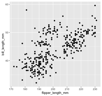
Now we'll use a different geom -- we'll add a layer of points to our plot using geom_point()
penguins %>% ggplot() + geom_point(mapping = aes(x = flipper_length_mm))## Error: geom_point requires the following missing aesthetics: y
Mapping with geoms
We get an error, telling us that geom_point() requires the y-aesthetic.
This makes sense -- we need an x and y axis to define where points belong on a scatter plot. Let's add bill_length_mm as the y-axis

Mapping with geoms
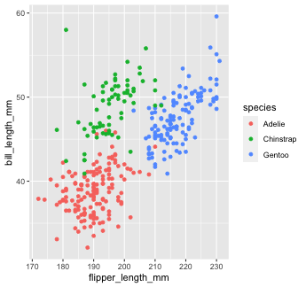
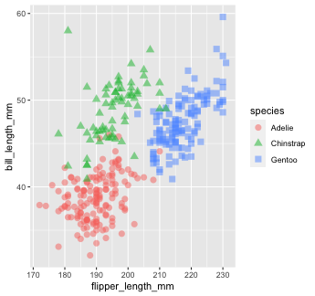
Let's find out if the relationship between flipper_length_mm and bill_length_mm relates to the species of penguin.
We'll map species to the color aesthetic (similar to fill, but for 1-d objects).
Mapping with geoms
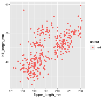
What happens if we tell ggplot to make our points red but accidentally include that inside the aes() call?
Mapping with geoms
Another thing we often want to do is to add a line over our scatterplot to describe the linear relationship between variables. We can do this by adding a geom_smooth() layer to our plot.
penguins %>% ggplot() + geom_point(aes(x = flipper_length_mm, y = bill_length_mm, color = species)) + geom_smooth(aes(x = flipper_length_mm, y = bill_length_mm), color = "black")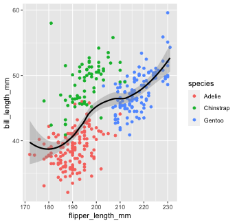
Note that "loess" is the default function for geom_smooth().
Learn more on that here.
You can change that by setting the method argument in geom_smooth(). Let's change it to our old friend linear regression or "lm"
penguins %>% ggplot() + geom_point(aes(x = flipper_length_mm, y = bill_length_mm, color = species)) + geom_smooth(aes(x = flipper_length_mm, y = bill_length_mm), color = "black", method = "lm")
Global aesthetic mapping
Let's re-make our previous plot using global aesthetic mapping
penguins %>% ggplot(aes(x = flipper_length_mm, y = bill_length_mm))+ geom_point(aes(color = species)) + geom_smooth(color = "black", method = "lm")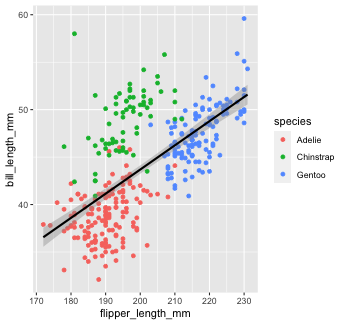
So...what do we put in global aesthetic mapping and what do we put in the aesthetic mapping of specific geoms?
You want to put anything in the global mapping that you want every layer to inherit (or at least the majority of them).
In the code above, I defined the x and y aesthetics globally, because I want those the same in every geom.
However, I don't define thecolor aesthetic globally, because color is geom-specific in this case.
Global aesthetic mapping
Let's take a look at the previous example again, but this time with color in the global aesthetic...
penguins %>% ggplot(aes(x = flipper_length_mm, y = bill_length_mm, color = species))+ geom_point() + # inherit global geom_smooth(method = "lm") #inherit global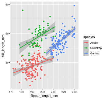
As you can see, global aesthetic mapping gets inherited by every layer. We can override this by providing a different aesthetic mapping in individual geom() calls...
penguins %>% ggplot(aes(x = flipper_length_mm, y = bill_length_mm, color = species))+ geom_point() + #inherit global geom_smooth(method = "lm", color = "black") #override global `color`
Your Turn 3
04:00
Use
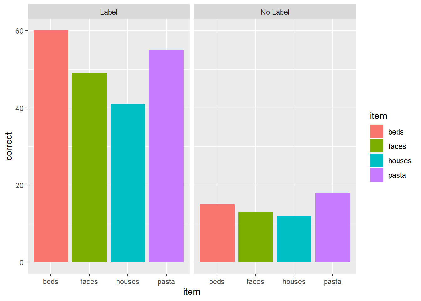
rio::importto read in the datasetpragmatic_scales_data.csv, which is saved inside thedatafolder. Save it to an object calledps_data.Take a glimpse at the data using
glimpse()orstr()to get a sense of the variables. You can alsoView()the data.Fill in the blanks in the code to re-create the plot below. Note: This plot uses a new geom called
geom_col(), which I've filled in for you.
Solution
ps_data <- rio::import(here::here("data/pragmatic_scales_data.csv"))glimpse(ps_data)## Rows: 588## Columns: 5## $ subid <chr> "M22", "M22", "M22", "M22", "T22", "T22", "T22", "T22", "T17", "T17", "T17", "T17", "…## $ item <chr> "faces", "houses", "pasta", "beds", "beds", "faces", "houses", "pasta", "pasta", "fac…## $ correct <int> 1, 1, 0, 0, 0, 0, 1, 1, 0, 0, 0, 0, 0, 1, 1, 1, 0, 0, 1, 1, 1, 1, 0, 1, 1, 1, 1, 0, 1…## $ age <dbl> 2.00, 2.00, 2.00, 2.00, 2.13, 2.13, 2.13, 2.13, 2.32, 2.32, 2.32, 2.32, 2.38, 2.38, 2…## $ condition <chr> "Label", "Label", "Label", "Label", "Label", "Label", "Label", "Label", "Label", "Lab…ps_data %>% ggplot(aes(x = item, y = correct, fill = item)) + geom_col() + facet_wrap(~condition)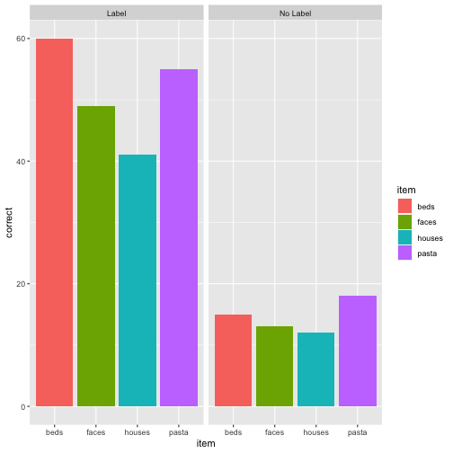
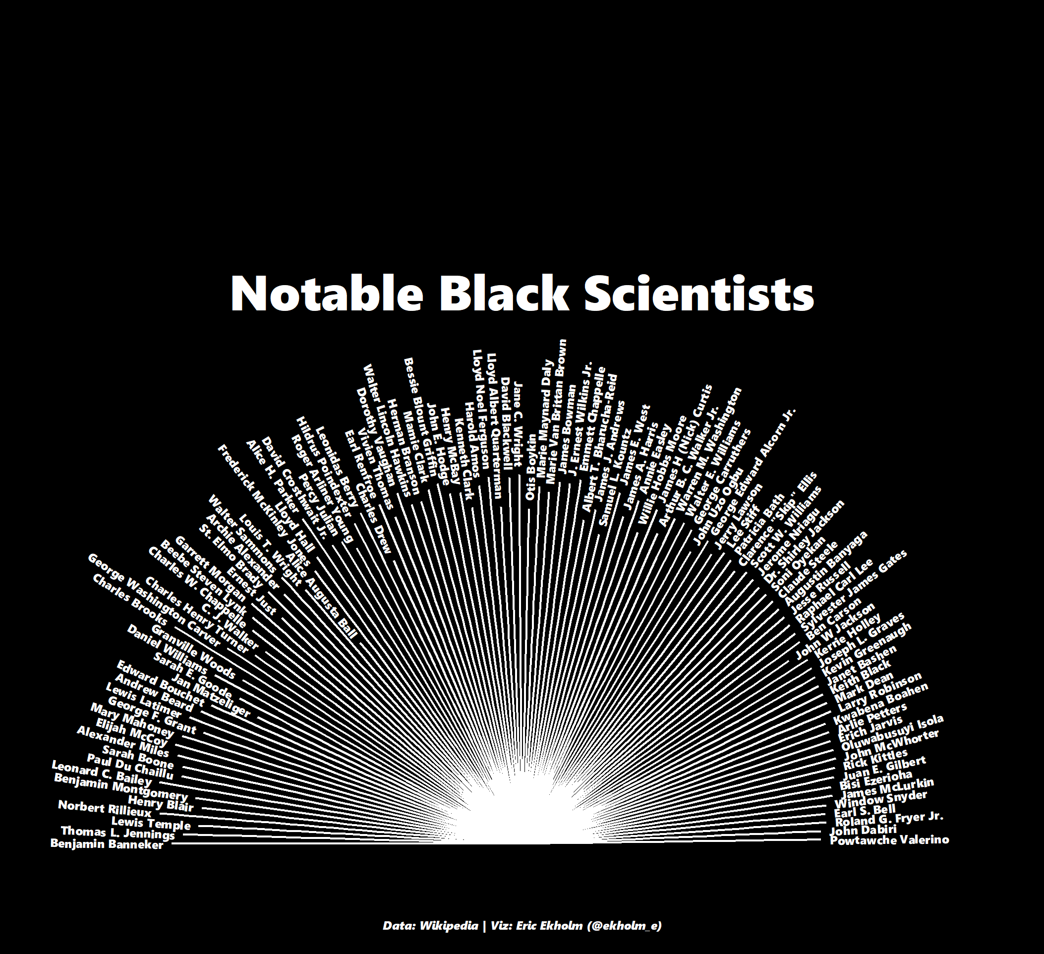
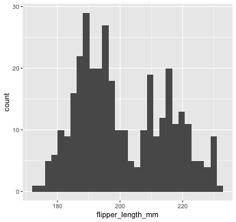
Example 🤯
Image from Eric Ekholm